
1. Abstract
This article describes a specific use case: visualizing a bar chart in a data view object.
2. Context
In some projects, it can be asked to render a bar chart in a data view object, to provide an immediate visual representation of the numerical values directly in line with the data. This allows users to more quickly grasp patterns, trends, or outliers without having to mentally compare raw numbers, improving readability and supporting faster decision-making.
While adding a Sparkline isn’t exactly the same, it still delivers meaningful value. For simpler use cases, it provides a flexible and user-friendly solution—powered by Excel formulas, making it easy for end-users to tailor as needed. Although the solution doesn't offer a precise graphical representation, it effectively supports visual trend recognition and offers a high-level perspective of the values..
3. Content
3.1 Horizontal bar chart in a table
3.1.1 Simple case
Simple cases is to show bars based on values, with a fixed scale.
In order to show bars is using the REPT function in algorithm, repeating the character █ (“full block”):
- Name: Full Block
- Unicode: U+2588
- Symbol: █
In this example values are scaled by 10.
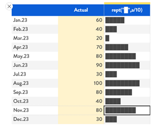
Figure 1:Simple Bar Chart
The algorithm is a simple text algorithm with the simple formula rept("█",a/10):
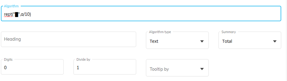
Figure 2:Algorithm definition
Given that the █ is a regular character, the color can be easily manage with the alerts:
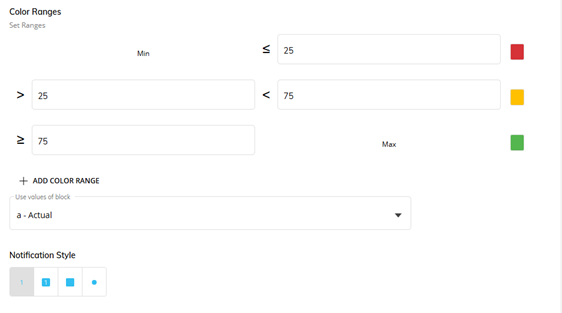
Figure 3. Alert configuration
Based on different option, alert color can be desaturated or not having these 2 different possible effects:
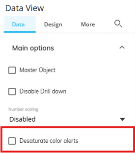
Figure 4. Data View options

Figure 5. Two possible styles
3.1.2 Simple Case - Positive and Negative values
The simple case shown before can manage only positive values. In order to be able to display in the same columns both positive and negative values it is needed to adjust the formula and the formatting to correctly display values.
Using the same example, where we want to represent the values on a scale of 10, we need to manage the number of empty blocks starting from the left:
- In case of positive values: 10 empty blocks
- In case of negative values: 10 – value to represent/10
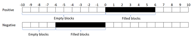
Figure 6. Schema
In order to correctly fill with space the same width of █ we used 2 spaces “ “, but it is necessary to format the block with the font Verdana, given that with this font the width are comparable.
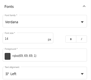
Figure 7. Block Format
Final algorithm formula is (where “a” is the block containing the data we want to represent):
if(a=0,"",if(a>0,REPT(" ",10)&REPT("█",ROUND(ABS(a) / 10, 0)), REPT(" ",10-ROUND(ABS(a)/ 10, 0))&REPT("█",ROUND(ABS(a) / 10, 0))))
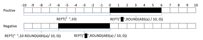
Figure 8. Schema with formulas
Explaining the formula:
- If a= 0 : mange the case where a =0 showing an empty string: “”.
- If a >0 : It starts with10 double spaces (" " repeated 10 times) to create left padding. Then it appends a number of block characters (█). The number of blocks is calculated by:ROUND(ABS(a) / 10, 0)
- If a<0: First, it creates(10 - block count) double spaces to push the blocks to the right. Then, it appends the same number of blocks as above. This creates a mirrored visual effect for negative values.
Figure 9. Bar chart for positive and negative values with Alerts
3.1.3 Scaling values
The previous examples used a fixed scale. However, it’s common to adjust the scale to better reflect the distribution of values and enhance visual clarity. As shown in the earlier example, using a fixed scale when dealing with smaller values can diminish the visual impact, making differences harder to perceive.
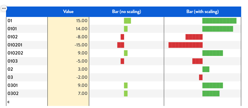
Figure 10. Compare bar chart with and without scaling
Values used in bar chart need to be scaled, using the simple rule (if we want to represent based on a 0 to 10 values scale):
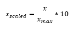
Where Xmax = MAX( abs(x)).
The method we need to use to calculate scaled value is using Nexel, which is the only method that allow to calculate the Maximum value in a given table’s column.
So braking the calculation in different steps (assuming block “a” contains the value we need to represent):
- Calculate the absolute value, can be a normal Algorithm “abs(a)” or in Nexel ABS([@A ;*;*])
- Calculate the Max of the absolute values. Nexel formula : =MAX([@b ;*;*;Range.Vertical]) where “b” is the block containing the previously calculated absolute values.
- Calculate the scaled value, Nexel formula =[@b ;*;*]/[@c ;*;*]*10 where b is the block with absolute values while c is the MAX value block
- Use the scaled value in a text Nexel algorithm in repeat function:
=if([@a ;*;*]=0,"",
if([@a;*;*]>0,
REPT(" ",10)&REPT("█",[@d ;*;*]),
REPT(" ",10- [@d ;*;*]) &REPT("█",[@d ;*;*])
)
)
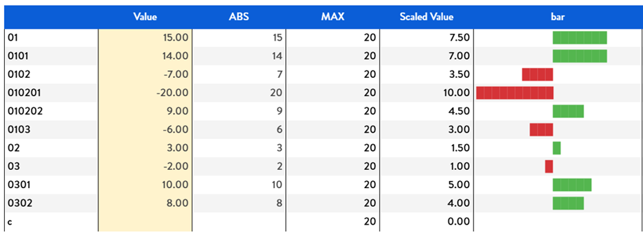
Figure 11. Calculation results using Nexel
Instead of being calculated in 4 different blocks, the formula can be combined except for ABS value that needs to be calculated in a dedicated block, since the system is not able in one combined rule to calculated the max of the absolute values in the vertical range.
So, once we have block “a” with values and “b” with ABS(a), we can implement the Nexel formula:
=if([@a;*;*]=0,"",
if([àa;*;*]>0,
REPT(" ",10)&REPT("█",ROUND(@a;*;*] / MAX([@b ;*;*;Range.Vertical])*10, 0)),
REPT(" ",10-ROUND(abs([@a;*;*]) / MAX([@b ;*;*;Range.Vertical])*10, 0)) & REPT("█",ROUND(abs([@a ;*;*]) / MAX([@b ;*;*;Range.Vertical])*10, 0))
)
)
Note that this approach only works if the block is left-aligned. If you require center alignment, you must ensure that all rows have the same total length by adding padding (spaces) accordingly. The Nexel formula remains the same, but you'll need to include the appropriate number of spaces to balance the positive (10 - a) and negative values (10 spaces) for proper alignment:
=if([@a ;*;*]=0,"|",
if([@a;*;*]>0,
REPT(" ",10)&rept("█",ROUND([@a;*;*] / MAX([@c ;*;*;Range.Vertical])*10, 0))&REPT(" ",10-ROUND(ROUND([@a;*;*] / MAX([@c ;*;*;Range.Vertical])*10, 0), 0)),
REPT(" ",10-ROUND(abs([@a;*;*]) / MAX([@c ;*;*;Range.Vertical])*10, 0))&REPT("█",ROUND(abs([@a ;*;*]) / MAX([@c ;*;*;Range.Vertical])*10, 0))&REPT(" ",10)
)
)
Figure 12. Bar with central alignment
Then, for sure, all not needed blocks can be hidden in final Data View.
Given that the graphical representation is based on 10 blocks it is not precise in representing the data. One small enhancement can be achieved using the characters:
- Left half block: “▌” (U+258C), to be used as last colored block for positive values
- Right half block: “▐” (U+2590) to be used as first colored block for negative values
With an easy rework of the formula to repeating the "█" for the integer of the scaled value ( int(<scaled value>) ), and adding the half block if the remaining decimal are close to 0.5.
Final effect will be like in following table:
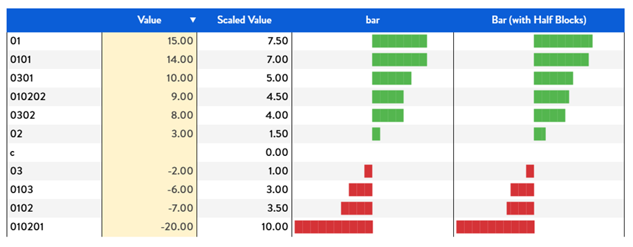
Figure 13. Use of half blocks
Here below an example where the delta % is displayed in Data View, using color Alerts:
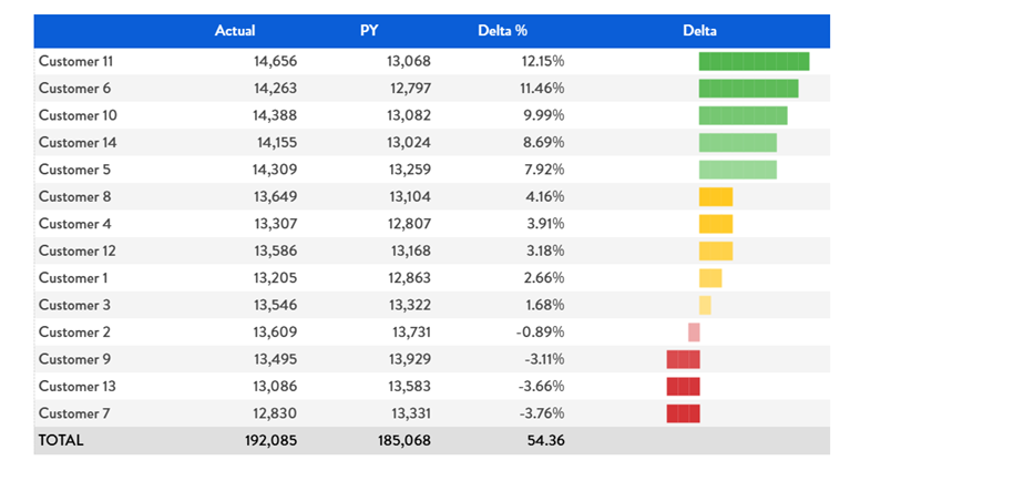
Figure 14. Bar chart for Delta %
Additional information can be added close to chart’s bar, like the value using the adding the formula at the end: &" "&ROUND([@c ;*;*],2)&"%"))
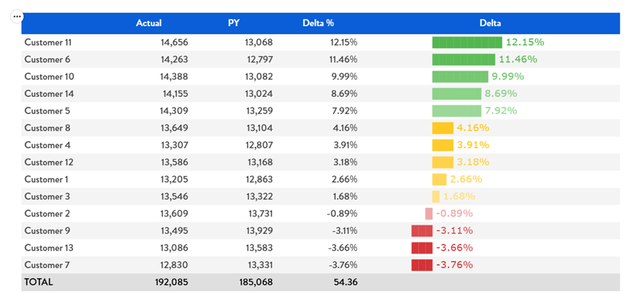
Figure 15. Bar and Values
Also in this case if we use also half blocks we’ll get more precise representation:
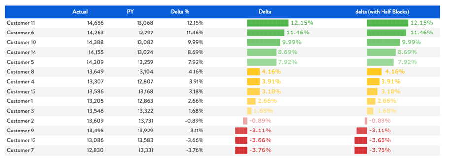
Figure 16. Bar and Values with half blocks
3.1.4 Normalized value
If the need is to represent a value like turnover or volume, it would be better to normalize it in a scale. We can use the same principle with the only difference that we need to use a different formula to normalize values.
In this case we want to represent values based on a scale from 0 to 20.
So the formula we need to apply is:
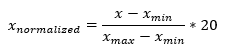
Again using Nexel we are calculating the Max and the Min value of our data set, and then based on this the normalized values that can be used for graphical representation:
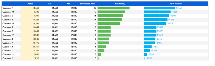
Figure 17. Bar chart representing Normalized Actual Volume
In the image are shown two different possibilities, where we are displaying only the bar or the bar followed by the values.
The same table can be used adding the row filter to display the top or the bottom n items (It may be needed to unflag the “Keep totals” to make it working):
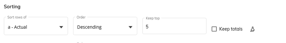
Figure 18. Sorting option
So we easily display, like in the example, the top 5 and the bottom 5 customers, keeping the same scale:
Figure 19. Top and bottom 5 customers
3.2 Suggestions and Technical Limitations
Since calculation are Nexel based, this solution is subject to all Nexel limitations and rules, see Board Manual.
The main recommendation is: KEEP IT SIMPLE.
The approach described in this article is intended for straightforward scenarios where you want to add a high-level, visually impactful representation of data directly within a table layout. It leverages Nexel formulas and simple text-based logic—not as a replacement for standard charting tools like bar charts or sparklines, which remain the best options for accurate data visualization.
While this method is relatively easy to implement in basic layouts, it can quickly become difficult to scale, maintain, and optimize in more complex situations—such as when dealing with large data volumes, intricate calculations, or advanced layout configurations.
Use Nexel thoughtfully, especially considering performance and maintainability. This technique is not recommended when working with "entity by column" or "blocks with Detail by" enabled, as these configurations significantly increase implementation complexity.
Additionally, note that Nexel is not supported in vertically aligned layouts.
Groups
The bar chart representation described here can be used with multiple entities displayed in rows. However, keep in mind that the Max and Min values are calculated within each group—this means the scale is consistent only within the same group, and comparisons across groups may be misleading.
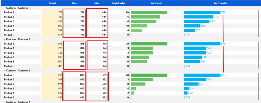
Figure 20. Scaling with row groups
Drill Down
This solution also works with drill-down functionality. However, note that the scale is recalculated at each drill-down level, so the proportions may vary from one view to another. This can lead to inconsistencies when comparing values across different drill-down levels.
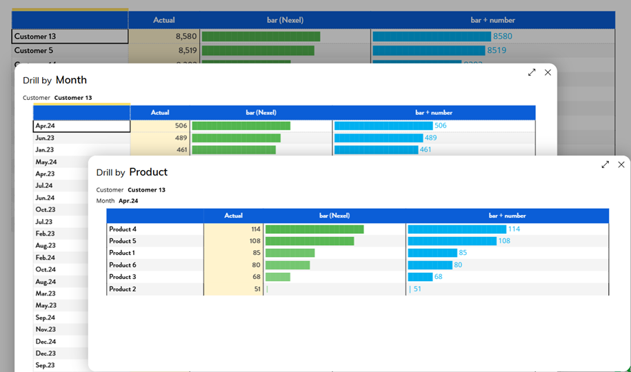
Figure 21. Drill down behavior
Unbalance Hierarchy
It can be used also when the entity by row is an unbalanced hierarchy, but extra care is required. In these cases, it is especially important to keep the layout as simple as possible and to thoroughly test the solution, including edge cases and deeper hierarchy levels. Always verify that the visual representation behaves as expected across all scenarios to ensure consistency and clarity.
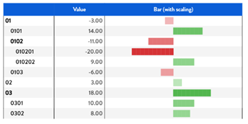
Figure 22. Usage with Unbalanced Hierarchy
If row grouping is applied in combination with an unbalanced hierarchy, the same limitation on scale consistency between groups still applies:
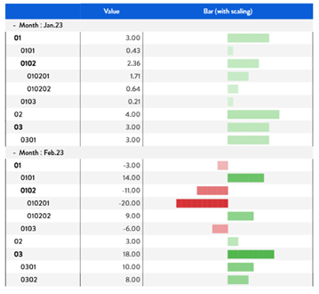
Figure 23. Unbalanced Hierarchy and Groups


