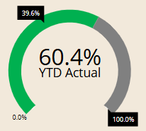
Hi team, the marker in the screenshot below is in the wrong position, i.e. 39.6% remaining spend should be in the grey section rather than green. Would be grateful for any help to fix this, thanks.
Hi @LB, What Board Version and Revision are you running? You can find that here:
This will help determine if this was perhaps a previous bug, or if instead this has to do with how the object is configured. Kind regards,
Hamza
Hi Hamza, it's 14.1, thanks.
Hi @LB ,
I think it's the normal and correct behavior of Gauge.
As far as I can see you are providing 3 values:
on the bottom left.
The Gauge represents values on a common scale, in your case ranging from 0 to 100. From a purely numerical perspective, your remaining spend is positioned correctly.
A workaround can be using a label representing the remaining:
It's position will be static.
Or, you could use a stacked bar chart to achieve a similar result. I know the example below isn’t great, but you can easily create a better one:
Hope this clarify,
Lorenzo
Thanks for your reply, Lorenzo. I have no problem with the calculations; the problem is the remaining spend % marker - that should be in the the grey area, not green. Apologies if I didn't communicate that bit clearly in the first instance. A static label is not ideal at the gauge is dynamic, depending on other filters I have on the screen.
Hi,
i clearly understand your need.
You'd like to have something like this:
I achieved this using 2 different Gauge (one above the other). Playing with the Max of the one used to display the remaining (max is not 100% on this gauge, but a value obtained playing with proportion to make remaining value falling in the expected range).
Then applying transparent background on the original gauge and hiding all the objects on the secondary Gauge (Value, Bar, Max-Min…).
It is not the best (I know) and it has some limitation when you fall in corner cases.
Finally, not to insist, but maybe playing with different type, it's easier to display the same information using label that can work even if with fixed position (this is a quick example where Remaining is a label):
Regards,
Hi Lorenzo, thank you for your suggestions/workarounds. It would be best if @Board Support conveys this problem to the lab team as something to be fixed.